Put the numbers on the screen — Chart slides for bar, line, and pie
Add a Chart slide in BibleSlides — Bar, Line, or Pie from the same data — so the room can see amounts, change over time, or parts of a whole beside the verse you teach.
Acts spends more of the book on one journey than another. A year of attendance rises, then drops. An offering, a morning, or a chapter splits into a few parts. You can feel the comparison in the study. The third row still hears a list of numbers and has nothing to look at.
BibleSlides Chart is the slide type for that beat. One window draws Bar, Line, or Pie. Leave the figure up while you say the one comparison the text needs, then go back to the verse.
A comparison that only lives in your notes is still private. If the congregation cannot see which amount is larger, which line is rising, or which slice is the largest part of the whole, you are asking them to hold a figure they cannot check.
How this differs from a Venn diagram, a measure, a poll, and one animated number
You may already use Venn Diagram when two truths overlap, and Ancient Units when the parable names a talent, a cubit, or a denarius. Audience Interaction lets the room answer a poll, a quiz, a rating, or a question. Animated Number puts a single figure on the screen and plays it: Count, Zoom, Slide, Scroll, or Multi-Zoom.
Chart is the figure made of several amounts. Bar compares them. Line shows change across the labels. Pie shows parts of one whole.
| Need | Use |
|---|---|
| “Faith and works — what is shared?” | Venn Diagram |
| “Ten thousand talents — how large is that?” | Ancient Units |
| “I need the room to answer this question” | Audience Interaction |
| “Show this one number, then move on” | Animated Number |
| “How do these amounts compare, change, or divide a whole?” | Chart |
Same sermon document. Add a Chart when the numbers belong on the screen, then return to the passage.
The pastor’s problem: a list of numbers is not a slide
What usually happens:
- You say “the third journey gets more of Acts” and point at the air
- You paste a spreadsheet, and the back row cannot read the cells
- You tour every bar, and the verse you came to preach never gets the wall back
None of that matches how you teach it. Name the figure. Say one comparison. Stop.
What Chart is
In the editor, the sidebar heading is SLIDE TYPES, with the hint “Click a type to add a new slide.” Chart is not in the default pinned row (Bible Verse, Bible Photo, maps, and the other pins). Open More slide types. That dialog reads: “Click on any slide type to open it. Use the pin button to add or remove slide types from the sidebar menu. Drag and drop to reorder.” The pin control is Pin to sidebar. The shortcut for Chart is Ctrl+Shift+R on Windows and Linux, Cmd+Shift+R on a Mac.
The catalog name is Chart. The description is “Create a bar, line, or pie chart with the same data.” There is no Line Chart row and no Pie Chart row in the sidebar or in More slide types. Those older type names still exist inside decks saved before the types were merged. Opening one of them uses this same window.
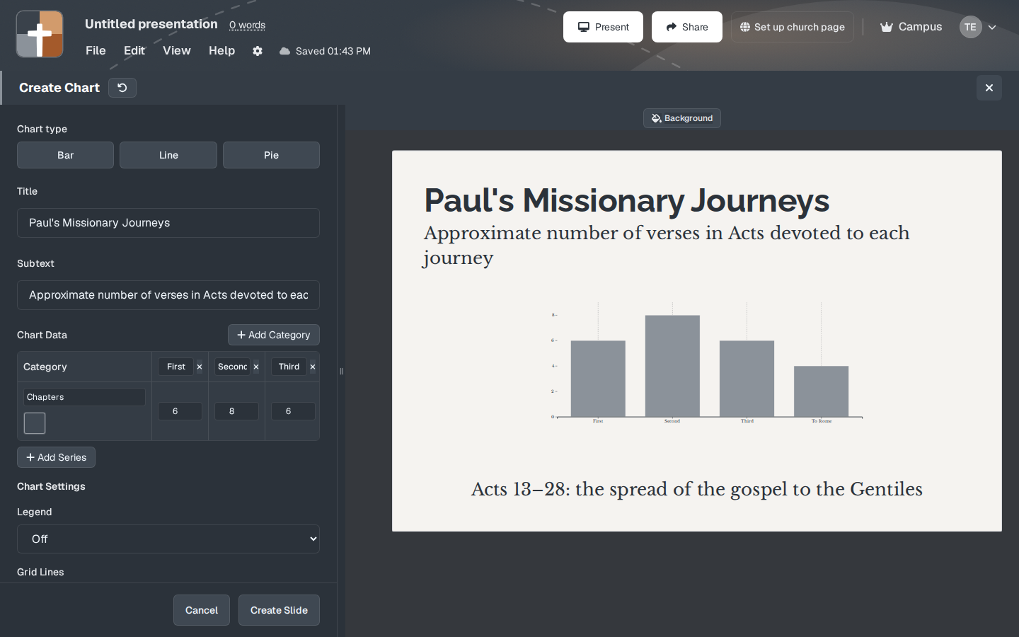
The modal title is Create Chart. Chart type is three buttons: Bar, Line, and Pie. A new slide opens on Bar, already filled with the sample below. Create Slide saves whichever type is selected. Cancel closes the window. A header control titled “Reset all settings to defaults” restores the opening sample.
The sample you replace before Sunday
| Field | Opening sample (Bar) |
|---|---|
| Title | Paul's Missionary Journeys |
| Subtext | Approximate number of verses in Acts devoted to each journey |
| Categories | First, Second, Third, To Rome |
| Series | Chapters — 6, 8, 6, 4 |
| Text Under Chart | Acts 13–28: the spread of the gospel to the Gentiles |
| Legend | Off |
| Grid Lines | Vertical |
| Axis Lines | Horizontal |
| Tickmarks | On |
| Column/Bar Padding / Group Padding | 10 and 10 |
Title size starts at 65%. Subtext and the line under the chart start at 70%.
Read that table before you preach it. The subtext says verses. The series is named Chapters, and the numbers are 6, 8, 6, and 4. Those figures are a shape for the preview. They are not a count to put under Acts 13–28 as if you had measured the chapters. Replace the title, the subtext, the categories, the series name, and the numbers with the comparison you will actually say. A chart that still says “Paul's Missionary Journeys” on a sermon about Nehemiah will be believed.
What you fill in
Title — placeholder “Enter title…”. This is the sentence the room should be able to read without you. Size and color sit on the label.
Subtext — placeholder “Enter subtext…”. One line under the title that says what the numbers are: verses, people, years, or the share of a morning.
Chart Data — for Bar and Line. The note on the label says categories are shown on the X-axis, and each series is its own color. Add Category adds a column. The note on that button says “Add a new category column to the chart.” Add Series adds another row. Its note says “Add a new data series to compare multiple datasets on the same chart.” Each series has a name and a color. You can remove a category or a series while more than one remains. On a bar chart, if the categories or the series are empty, the slide says “Add data to display the chart.”
Legend — Off or On, for Bar and Line. The note says it identifies each data series by color. Leave it Off for one series, the way the sample does. Turn it On as soon as a second series shares the grid.
Grid Lines — None, Vertical, Horizontal, or Both. The sample uses Vertical. Horizontal is the easier read when the point is height.
Axis Lines — None, Horizontal, Vertical, or Both. The sample uses Horizontal.
Tickmarks — a checkbox, on in the sample. The note says they are small marks along the axes.
Column/Bar Padding and Group Padding — Bar only. Each runs from 0 to 50. The sample starts at 10. Column/Bar Padding is the space between bars inside a group. Group Padding is the space between categories.
Chart Label Font — size and color of the category names and axis labels. It starts at 100%.
Text Under Chart — the sentence under the whole figure. The box placeholder mentions Markdown (**bold**, *italic*, lists). On the slide the line is plain text, so type the sentence you want read, without asterisks. Size starts at 70%.
Background — the toolbar button opens a window titled Background, with the line “Color, your images, or the photo library.”
These settings sit under the heading Chart Settings, except Title, Subtext, Chart Data, Text Under Chart, and Background.
Line and Pie, before you press Create Slide
While you are still creating the slide, Line keeps the title, subtext, categories, and series, and draws a line instead of bars. Pie turns those categories into slices and uses the first series for the values. A second series does not become a second pie. Going back from Pie to Bar or Line rebuilds one series named Data from those slices.
Create Slide stores the type that is selected at that moment. If the button still says Bar, the slide will be bars. After the slide is in the deck, Chart type is locked. The window title is Edit Chart, and the button reads Update Slide. Choose Line or Pie before you create the slide. An older deck that already stored a line-chart or a pie-chart still opens here, on that type.
Line adds two controls the bar chart does not show: X-Axis Padding (on by default) and Line Thickness, from 1 to 10, starting at 2.
Pie replaces Chart Data with Chart Slices, under the title and subtext. Add Slice adds a row. The columns are Label, Value, Color, and Actions. A new slice starts with the next letter and the value 10. Chart Labels sits above the title: Show Labels on Slices and Show Percentages on Slices (both on to start), and Label Distance from Center when either is on. Legend is a button that reads Legend: Off or Legend: On. When it is on, Legend Font Size, Legend Distance from Chart, and Legend Line Height appear. Inner Radius runs from 0 to 80 and starts at 0, a full pie. Raise it to open the center. Use High Contrast Colors swaps the slice colors for a stronger set. Grid Lines, Axis Lines, Tickmarks, and the two padding sliders belong to Bar and Line. They are not on a pie.
Keep a pie to a handful of slices. A pie of unrelated totals — one slice “years,” another “people” — still draws, and it still does not mean a whole. The numbers should be parts of one thing. Text Under Chart is the sentence that names that whole.
While you present
Chart has no steps. Projector and tablet show the same figure. Speaker notes stay in the document under that slide.
Bar compares amounts. Line shows a change across the labels. Pie shows parts of one whole. Read the title, then one comparison — once the numbers are yours, not the sample’s — and stop. The chart does not need a tour of every bar.
A bar slide made from SnappyBible (Make slide on a word or chapter chart) opens that card again when you click it. It does not open Create Chart. Use this window when you are entering the categories yourself.
Free, and the slide limit
Chart is on the Free plan. Choosing Line or Pie does not change the plan. It is not in the insert gate that blocks Bible photos, 3D maps, Family Tree, Ancient Units, and 3D models. New accounts include 30 days of Premium with no card. After that, Free still includes this slide type.
Free still limits a presentation to 7 slides and the account to 3 presentations, and a watermark is added to slides. A chart is one of those seven, next to the verses. See the Free plan write-up.
A quiet Sunday workflow
- Decide whether the room needs the numbers as much as the next verse. One comparison.
- Add Chart from More slide types, from the sidebar if you have pinned it, or with Ctrl+Shift+R (Cmd+Shift+R on a Mac).
- Leave Bar, or choose Line or Pie, before you press Create Slide.
- Replace the journey sample. Title, subtext, categories, series, and the line under the chart should be the sentence you will say.
- Turn Legend on when more than one series shares the grid. Keep a pie to a few slices that are parts of one whole.
- On Sunday, show the chart, read the title and one comparison, then advance to the Bible Verse slide.
When to leave it closed
- The verse already on screen carries the comparison, and your notes are enough for you
- The point is overlap of ideas — Venn Diagram
- The point is a biblical measure — Ancient Units
- The point is a response from the room — Audience Interaction
- The point is one number arriving on screen — Animated Number
- The sample is still on the slide. Do not leave “Paul's Missionary Journeys” over a sermon that is not Acts
BibleSlides stays a quiet servant: Scripture first, the figure when it serves the Word, then out of the way.
FAQ
Is Line Chart or Pie Chart its own menu row?
No. Chart type inside Create Chart is Bar, Line, or Pie. Older decks may still store a line or a pie as its own type. You edit those here. On a slide you have already created, the type buttons stay locked.
Will the sample numbers survive if I only change the title?
Yes. Changing the title does not rewrite Chapters 6, 8, 6, 4. Replace the data.
Does the chart build one bar at a time?
No. The whole figure is one slide. There are no steps.
Tablet and Free?
The tablet shows the same chart. Adding the slide is included on Free, inside the 7-slide limit. See the tablet presenter guide.
Try it on the passage you are already teaching
Open the sermon and put one comparison on the screen — journeys in Acts, a rise and fall you will actually defend, or the parts of one whole the text names. Then go back to the verse. The chart serves the sentence you came to preach.
Related guides
See BibleSlides features
Notes and slides in one document, Bible Verse slides, stepped markup, Verse Analysis, 3D maps, BiblePlaces photos, and tablet presenter apps — built for pastors who teach Scripture.